Sun Drop Juice Pop (fictional) was established by Andrew Herbert and Lydia Herbert, a couple native to Louisiana. They recognized that there were no carbonated fruit juice beverages that catered to kids. Sun Drop Juice Pop specializes in making carbonated drinks made with 100% juice — a healthier alternative for kids.
Challenges
The challenge was to create a packaging design that represent the brand values. They want the packaging to be fun and motivate kids to drink their healthy beverages.
Solution
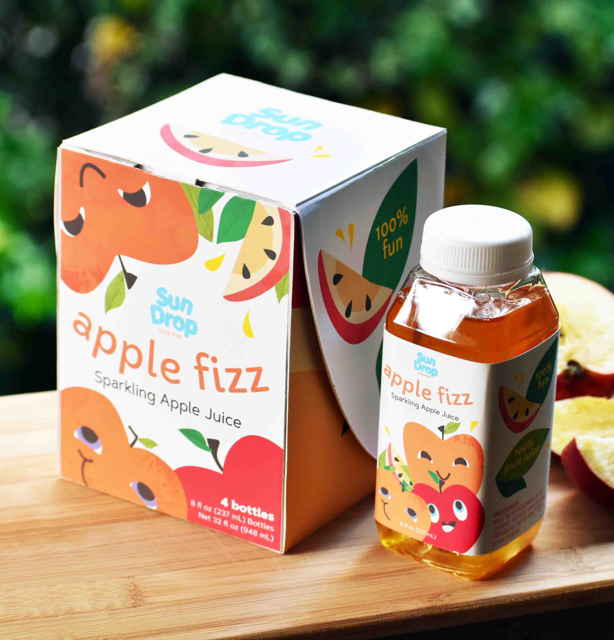
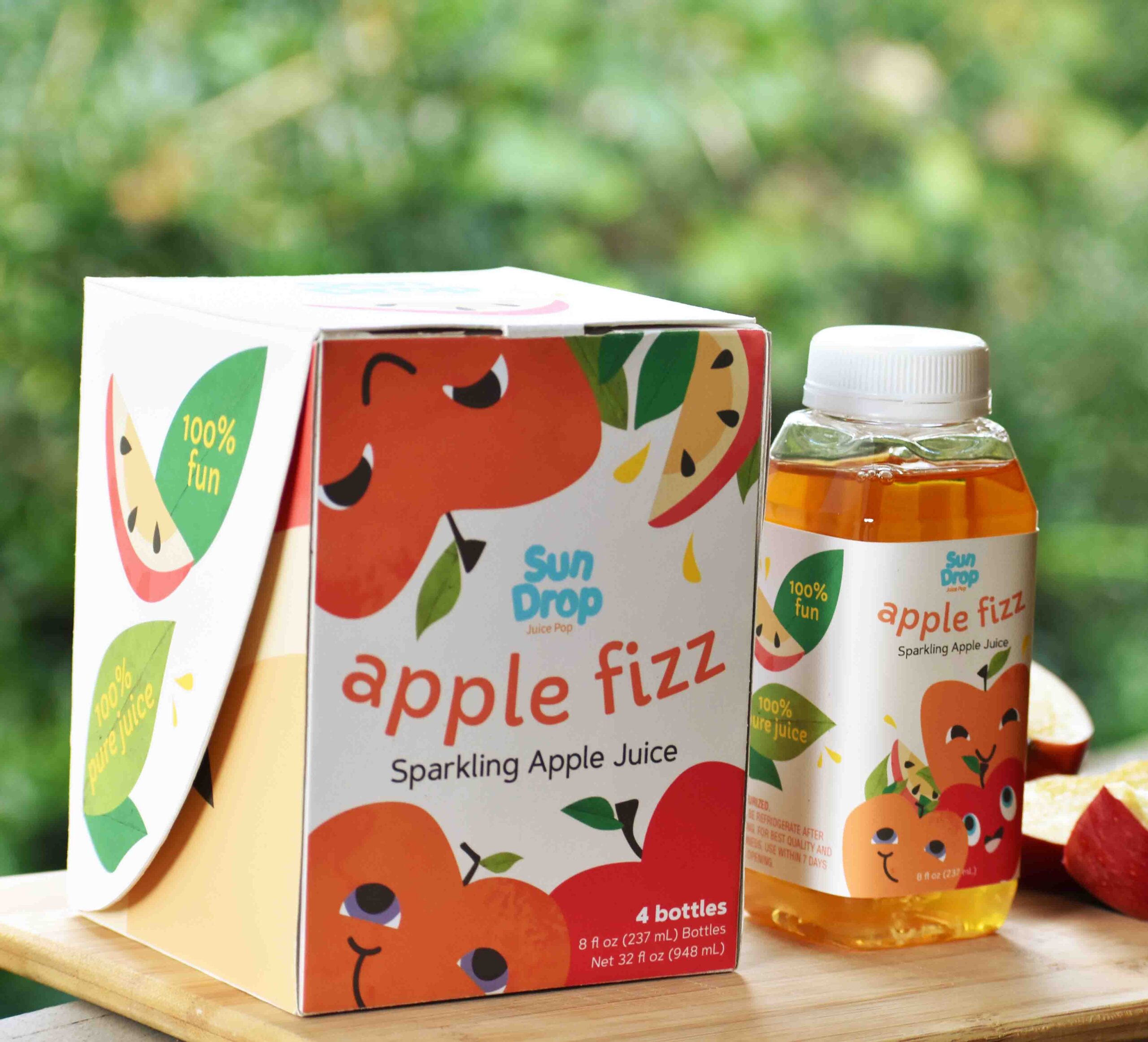
A cute, and fun packaging was designed for the sparkling juices, which are sold in a pack of four drinks. The packaging for the container is designed with kid-friendly illustrations to catch both children and parents’ eyes. Each flavor will feature different fruit characters that are associated.
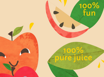
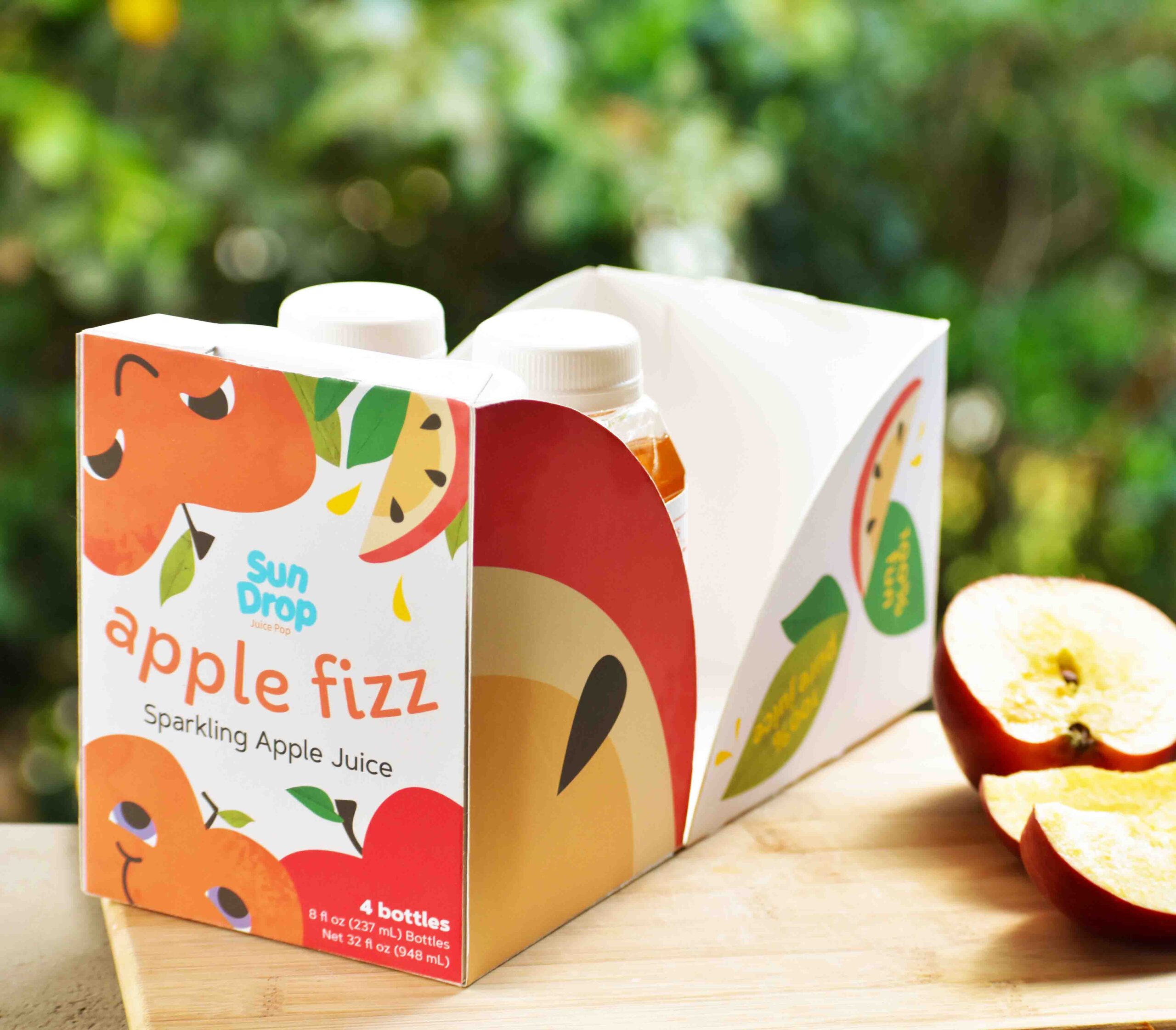
The final packaging features happy, cute apples to go with the brand’s value of healthy, fun drinks. The container is a rectangular shape with characterized apples all over the front and back cover. The front and back covers specify the juice name, title of the drink type, and quantity of bottles for each container. The sides of the container features apple slices, leaves, and quality of the drink: 100% pure fruit juice and 100% fun. The container opens up like a mouth to reveal large apple slices that fit the form of the sides.
Each bottle label corresponds with the design of the container. The apple characters are adjusted to fit the shape of the label. The drinks are produced in plastic bottles to be safe and easy for kids to drink and use.
The packaging was designed with the brand’s values in mind: producing healthy, fun drinks for kids. Vibrant and natural colors were used to reference the healthy, fun drinks. Additionally, the packaging design targets children and parents who aim to live a healthy lifestyle.


View other projects