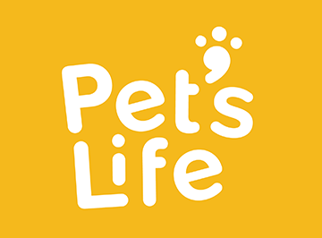
Pet’s Life is a fictional no-kill animal shelter that believes every animal’s life is precious and deserving of a loving home.
Challenges
The challenges of this project were to create a friendly and fun logo and annual report.
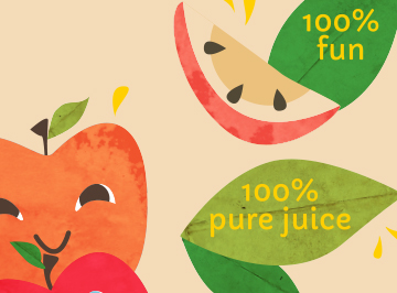
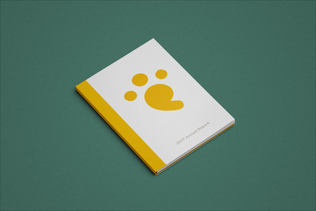
The logo represents the playfulness and friendly aspects that are representational of all pets and animals. The font colors are chosen to mimic their energy. Gray was chosen to help the yellow pop more. The font choice was to depict the aspects mentioned before. The font is round, friendly, and is placed/composed to look like it is in motion. The apostrophe is designed to look like a pet paw like the pet was playing and stepped into the motion.
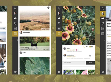
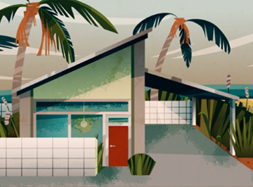
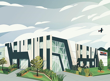
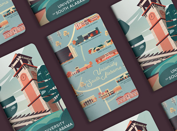
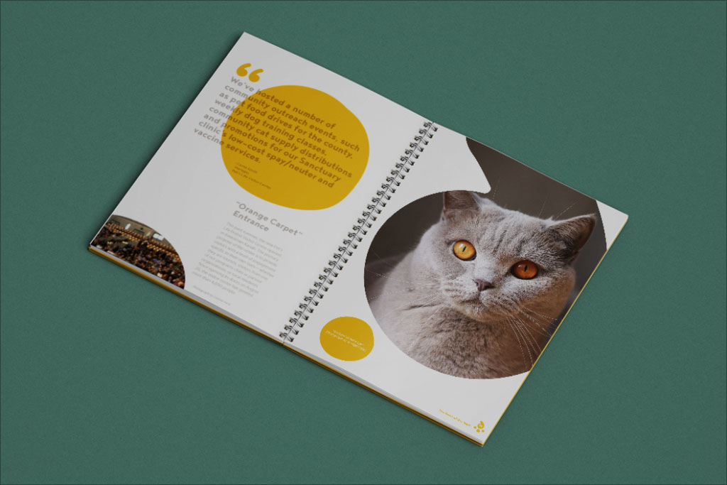
The annual report keeps consistency in the logo thought process and design. The use of the apostrophe mark emphasizes the brand and brings focus to the images.

View other projects