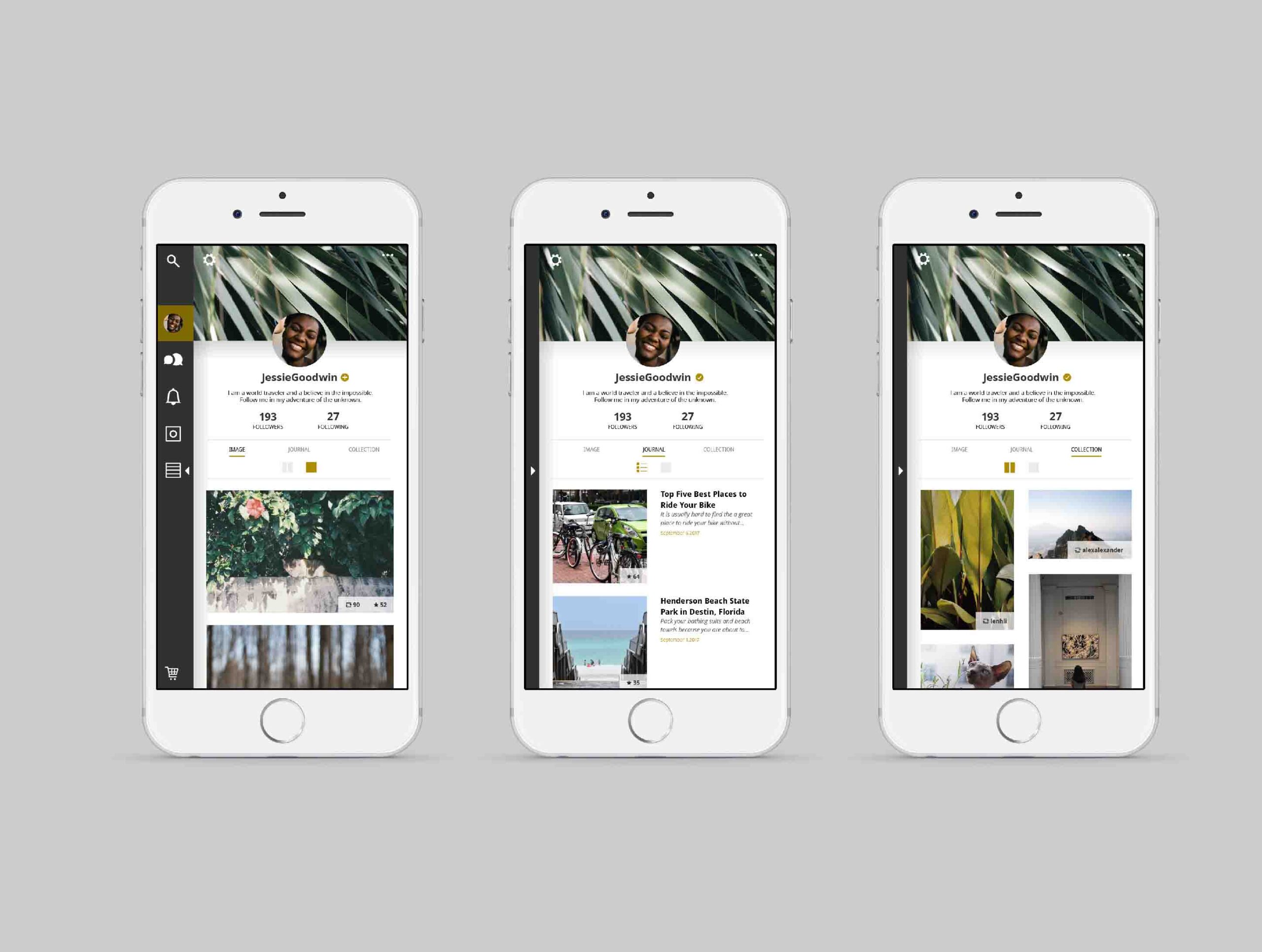
VSCO is a popular app that provides a creative space with photo capabilities for all photographers. They have a wide range of photo filters that users use to enhance and share their images.
Challenges
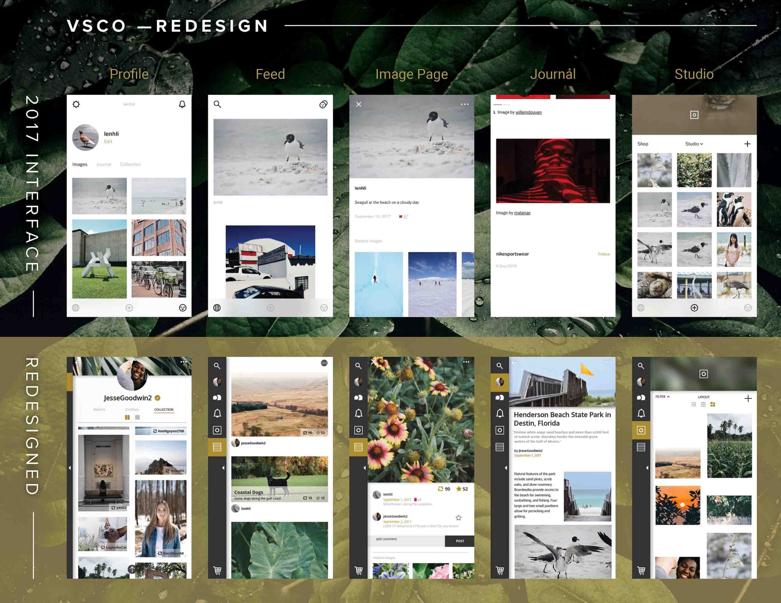
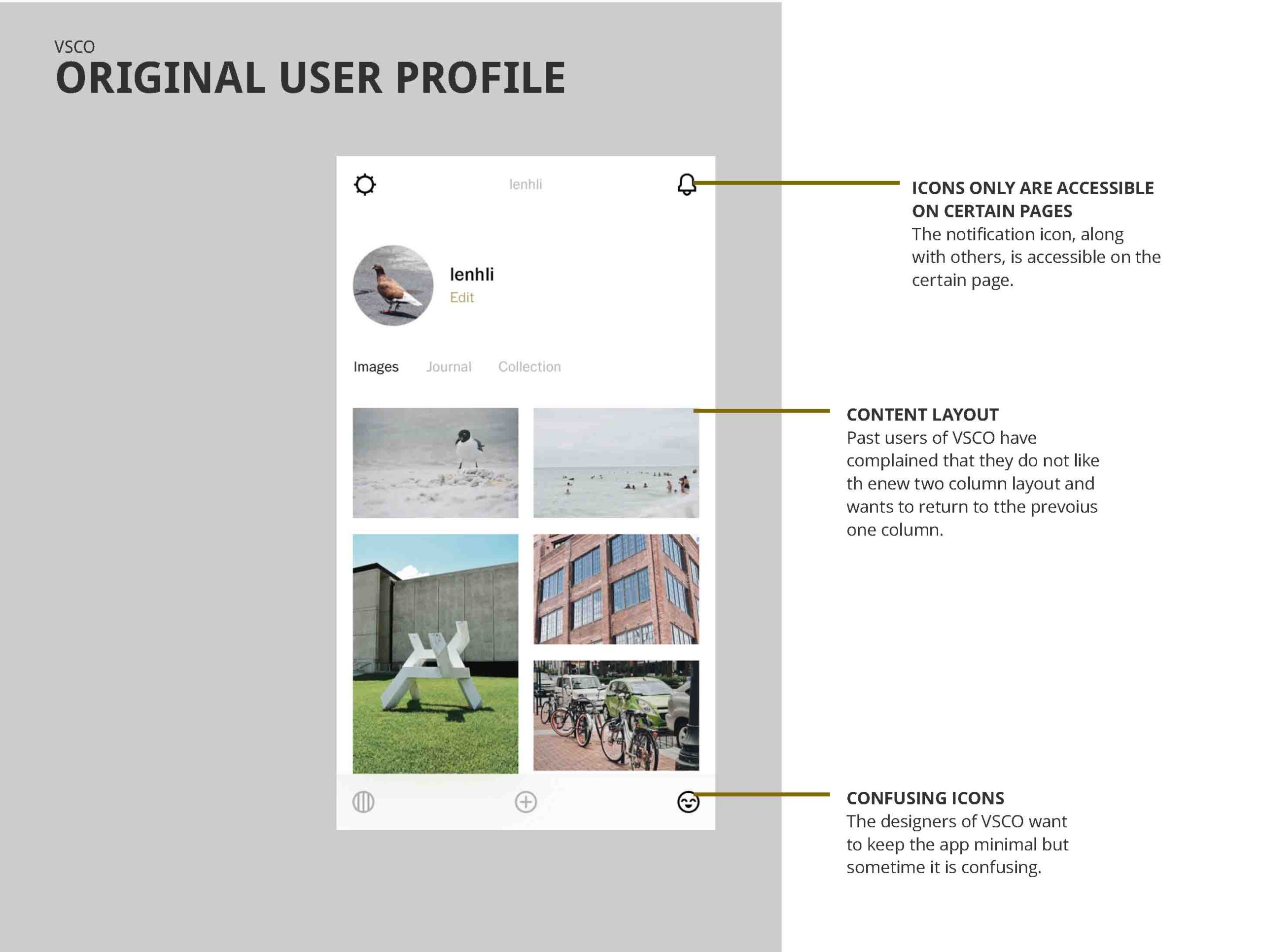
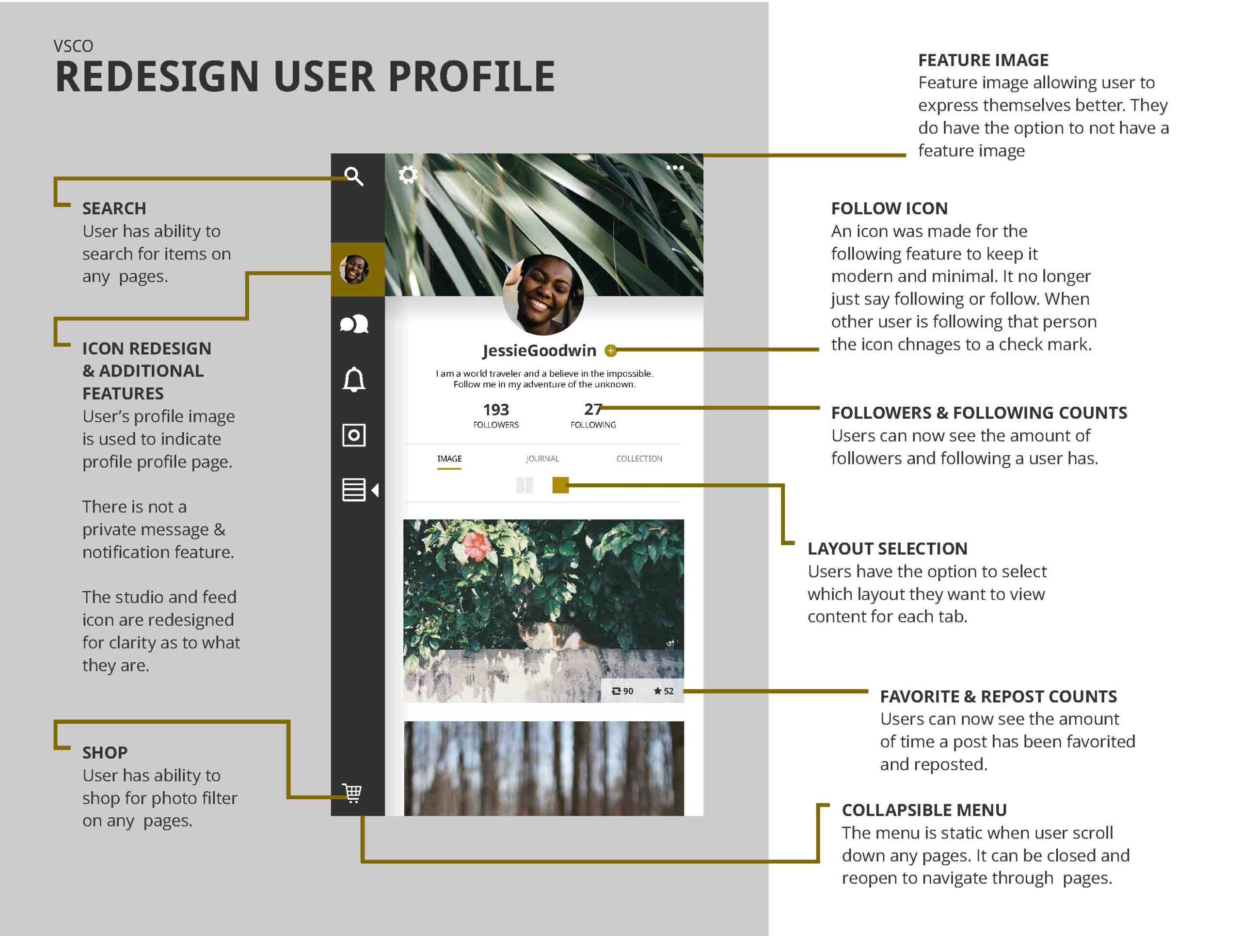
In 2017, VSCO had an update that made the app very confusing for old and new users. The company prides itself on being a social outlet where people can share their best images. However, at the time, there were a few missing contents that could be included for users to socialize with others on the next level. The app did not have a way for users to keep track of the amount of followers they have or other people to view it. The app did not have a comment or private message feature. Some important icons are only accessible on certain pages like shop and search.
Solution
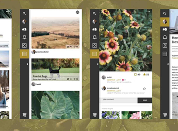
This redesign VSCO was to help improve the app UI/UX while keeping the company image, ideal, and values. The redesign added a journal entry option and more community interaction opportunities for users to stay on the app longer and communicate with others in the community.
APP Video Walk-Through
A video displaying the interface of the 2017 VSCO app with the redesign.
View other projects


